let's talk.
Get in touch with me
connect.
Find me on LinkedIn
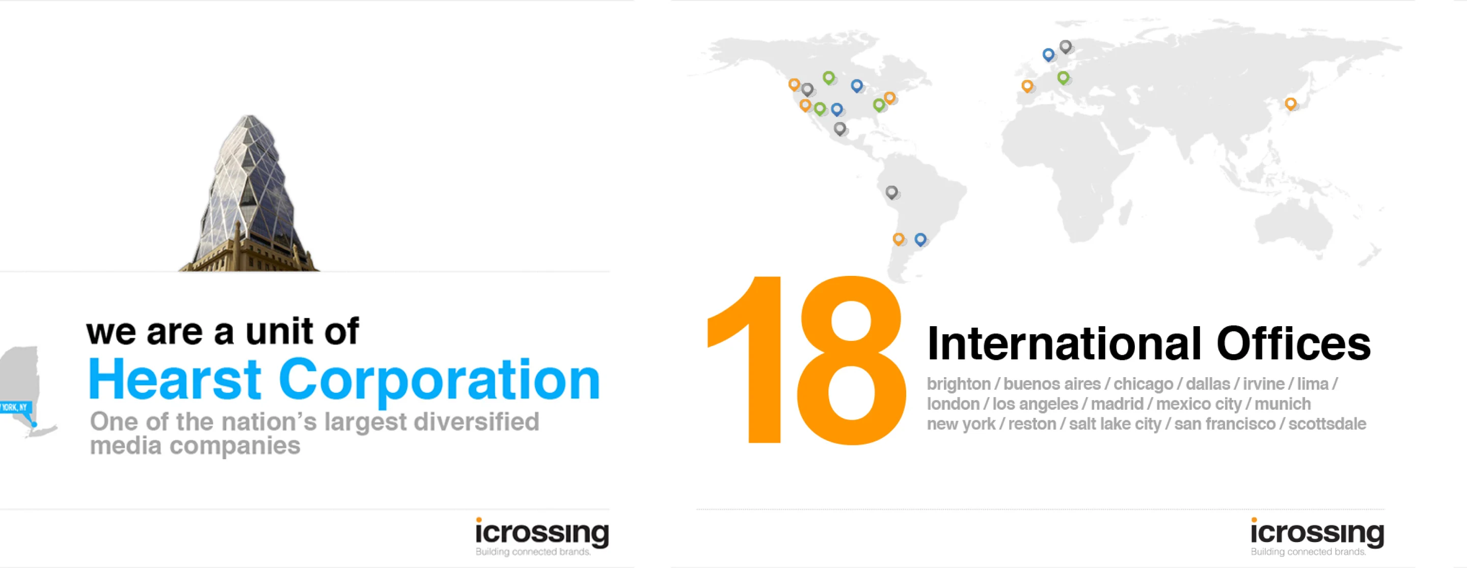
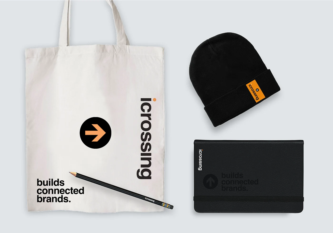
iCrossing, a global digital agency owned by Hearst, was looking to refresh its brand identity following a new logo rollout. Partnering with the Executive Creative Director, I developed a visual system that extended the logo into a cohesive brand identity—spanning business cards, pitch decks, agency swag, and a style guide to ensure consistency across all channels.
Following its acquisition by Hearst, iCrossing needed a refreshed identity that felt bold, modern, and memorable. The challenge was to translate the new logo into a broader system that conveyed the agency’s personality, strategic edge, and creative talent—ensuring it could stand out in a competitive industry while resonating with both clients and employees.

Business cards set the tone for the refreshed identity, balancing boldness, modernity, and creative energy. From playful typography to personality-driven details, each concept ensured the cards stood out while establishing a foundation for the broader brand system.

In this concept, I played with the “i” in iCrossing, making it the format of the card. Whether the card is inserted in a wallet or laying on a table, it easily stands out and makes a statement—expressing both the boldness and uniqueness of the agency.
Typography is the main focus for this concept. The objective was to make an interesting composition, void of excessive graphics, keeping the space clean and elegant. To add a touch of whimsy, I replaced traditional job titles with descriptive adjectives, giving this extension of the brand more personality.


In this concept, I wanted to communicate that the agency is obsessed with their craft, thereby bearing the term “geek” on the front of the card. Each service line is assigned its own color and “geek classification”. Some cards could include quirky headshots for team members to express their personality.
In this concept, I played with the “i” in iCrossing, making it the format of the card. Whether the card is inserted in a wallet or laying on a table, it easily stands out and makes a statement—expressing both the boldness and uniqueness of the agency.
Typography is the main focus for this concept. The objective was to make an interesting composition, void of excessive graphics, keeping the space clean and elegant. To add a touch of whimsy, I replaced traditional job titles with descriptive adjectives, giving this extension of the brand more personality.
In this concept, I wanted to communicate that the agency is obsessed with their craft, thereby bearing the term “geek” on the front of the card. Each service line is assigned its own color and “geek classification”. Some cards could include quirky headshots for team members to express their personality.
To codify the refreshed identity, I built a brand guide with clear rules for typography, color, and visual applications. This ensured consistency across all touchpoints, strengthening brand recognition both internally and externally.


To codify the refreshed identity, I built a brand guide with clear rules for typography, color, and visual applications. This ensured consistency across all touchpoints, strengthening brand recognition both internally and externally.
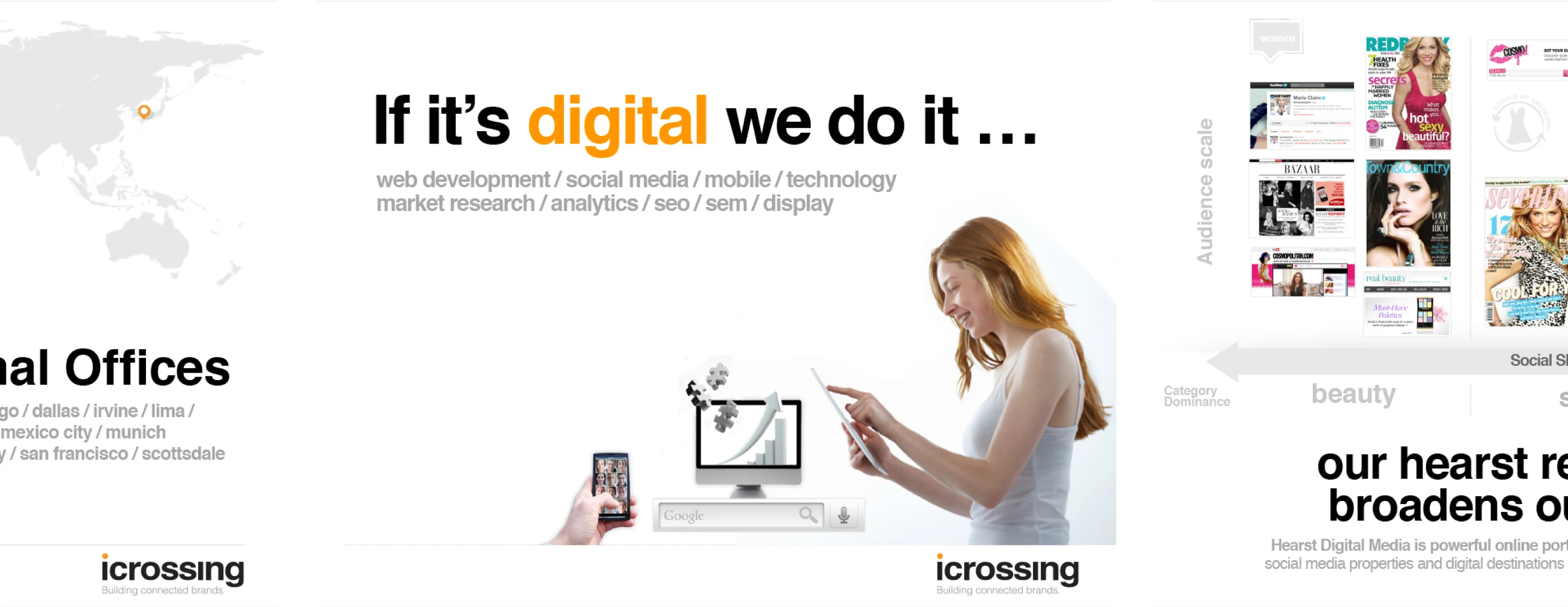
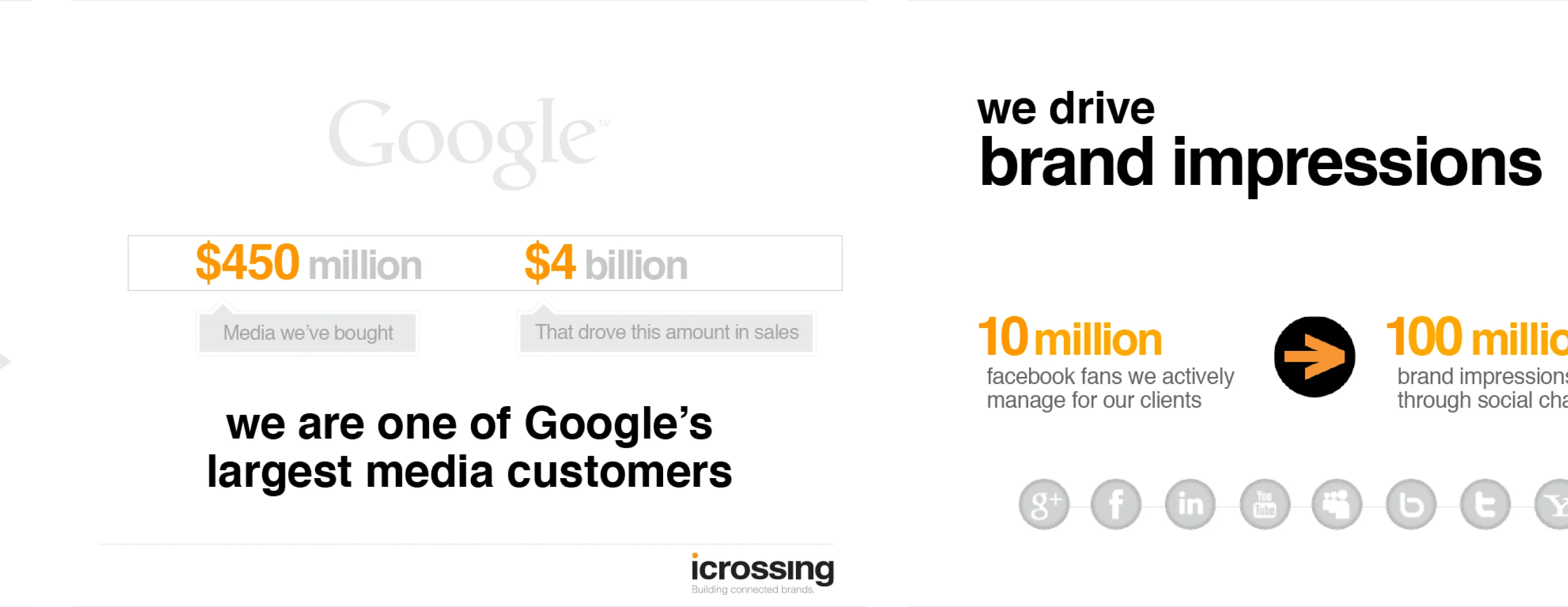
I designed a graphically rich presentation deck that equipped the pursuit team with a polished, brand-consistent tool for new business. Bold visuals and a clear narrative showcased the agency’s expertise and strengthened credibility in client pitches.