Rewards Network is a loyalty company that enables members to earn rewards from major airlines, hotels, and retail partners when they dine at participating restaurants, bars, and clubs. As Creative Director, I led the redesign of the company’s partner email program, the primary marketing channel for member engagement.
Engagement had grown stagnant, with emails underperforming across key metrics. Responsiveness, brand alignment, and user clarity were lacking, leaving messages uninspiring and often off-brand. To reverse this trend, I spearheaded a comprehensive email redesign—elevating design, refining copy, and rethinking the member experience from first touch to ongoing participation.
Elevate the caliber of the design, rewrite subject lines, and establish a benefit-driven copy direction in order to encourage consumers to act
Resolve usability vulnerabilities, specifically those emails that scored low in the areas of responsiveness and brand recognition
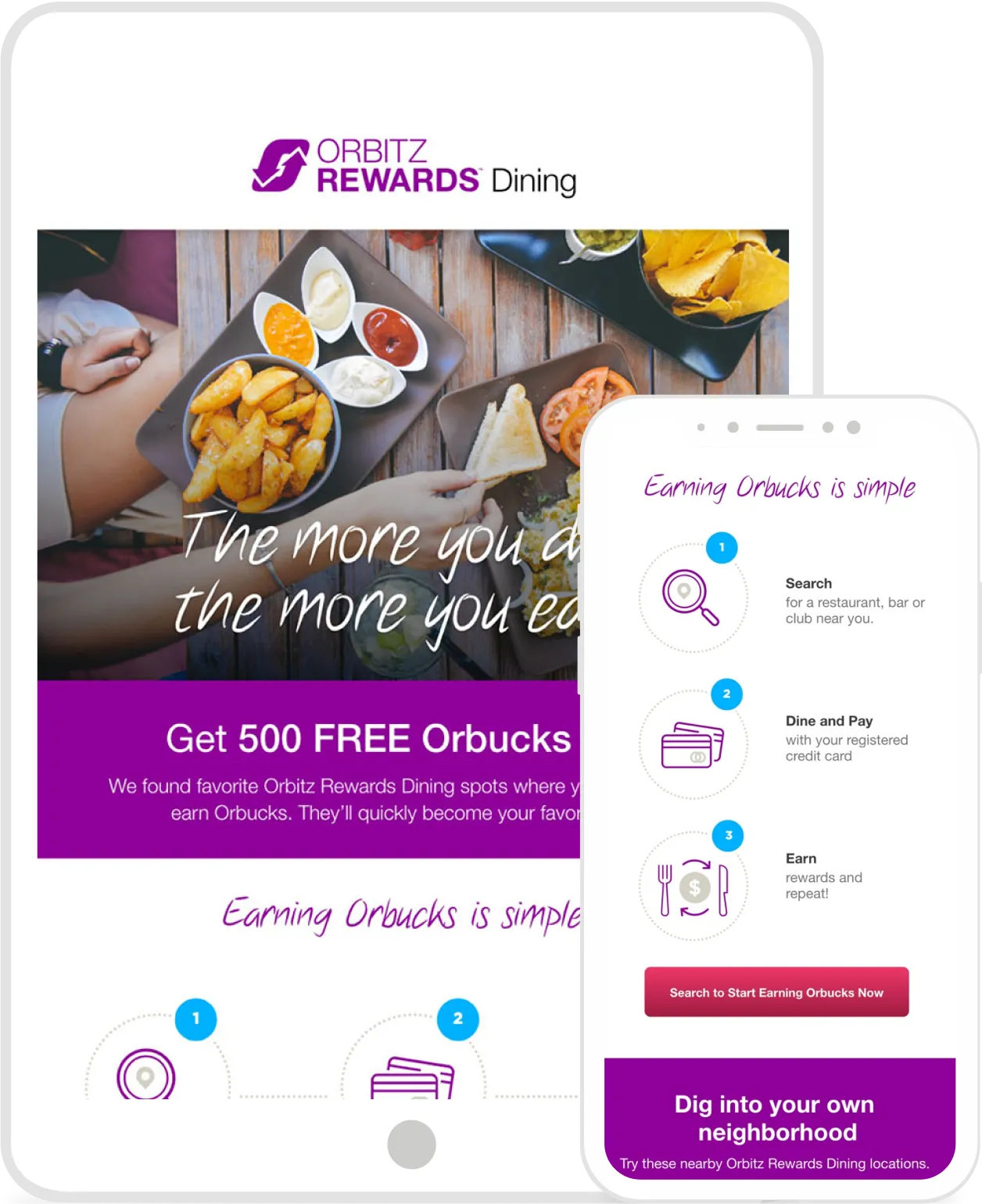
Ensure the new emails are a visual extension of the partner’s branding, not a complete departure—which they were at the time
With inboxes overflowing, only the most engaging emails capture attention. This redesign reframed rewards as memorable dining experiences, using design and copy to inspire action while achieving clear business goals.


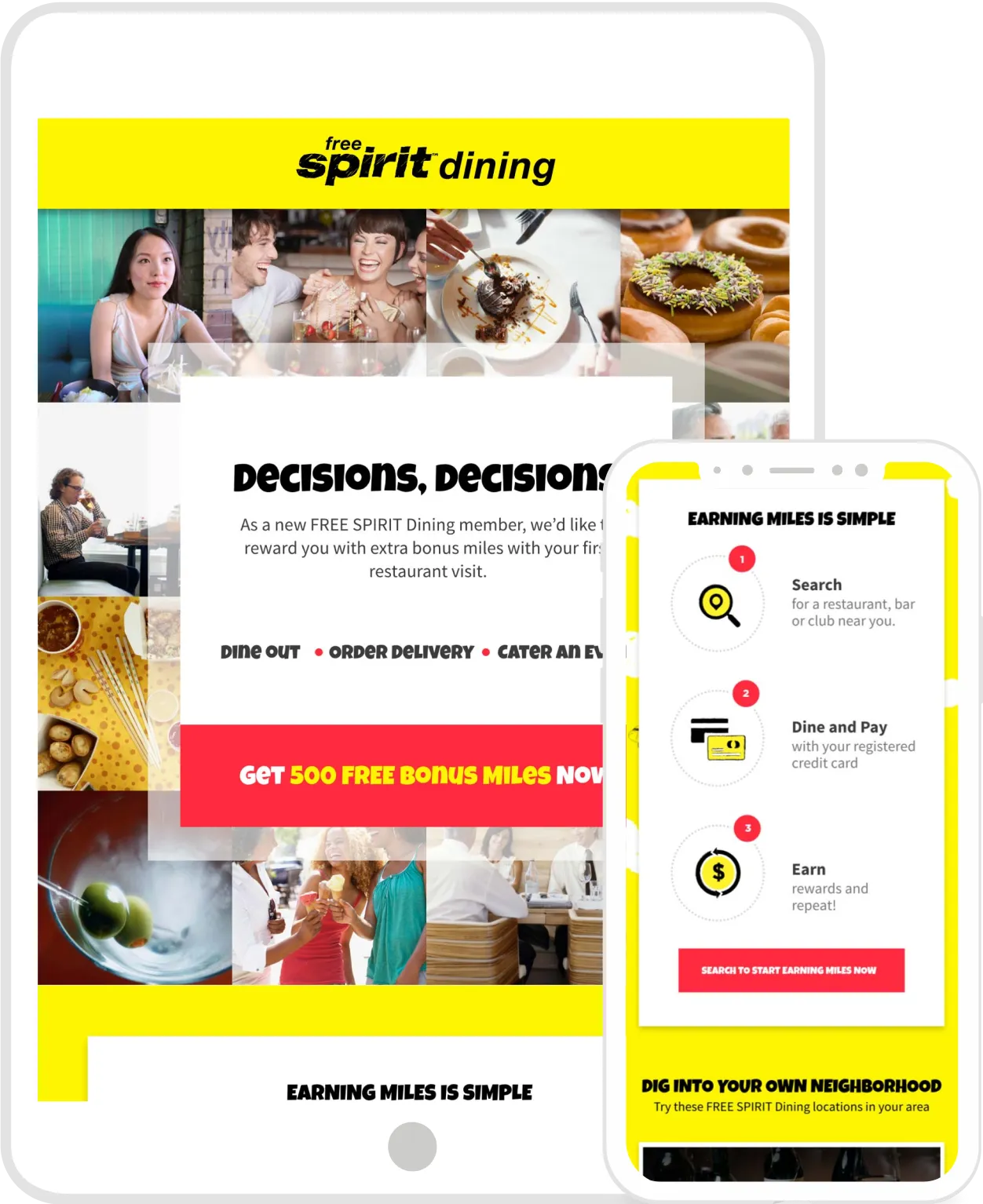
To further support the creative strategy, we would combine striking food photography with happy patrons enjoying themselves at various restaurants, bars, and clubs. This approach puts the focus on consumer experiences, in an effort to encourage members to participate.


New member prospects receive an initial email to incentivize their first dine with a bonus offer. Evocative imagery is used to draw the reader into the bonus content, then to participating restaurants, bars, and clubs located within a 10 mile radius.


If no dining activity has been detected after the Activation email, the Ways to Dine email is sent as a reminder. Other convenient ways to earn rewards (aside from dining out), are prominently featured to intrigue prospective members and incentivize them, again, to act and earn.


If the prospective member hasn’t dined after receiving the first two emails, the More You Dine email is sent. The messaging is more direct with a focus on earning more.


This is the final email sent to prospective members during the last week of bonus eligibility. Meant to convey a sense of urgency, the design is purposefully void of photography, as the copy is the main feature and is emphasized by overlaying a highly contrasting background color for maximum visibility.


