
let's talk.
Get in touch with me
connect.
Find me on LinkedIn
Contracted through iCrossing, I partnered with the Chuck E. Cheese creative team to build a visual design system for ChuckEcheese.com. The project established a unified set of rules, components, and patterns that ensured brand consistency while enabling the development team to scale updates more efficiently.
The site lacked the documentation and structure needed to scale effectively, leaving the development team without clear design standards. My role was to create a systemized framework—complete with style guides, templates, and component libraries—that would guide future work, maintain consistency, and preserve the brand’s playful identity across digital touchpoints.
I created a high-level UI style guide that standardized patterns, components, and reusable elements for the site. This documentation provided a framework the client could use to design and deploy at scale while preserving the integrity of Chuck E. Cheese’s established brand.


Using Material Design principles, I established responsive grids for desktop (12 columns), tablet (8 columns), and mobile (4 columns). This ensured content scaled proportionally across devices and provided developers with a clear foundation for rebuilding the site responsively.

To improve efficiency, I audited site content and identified redundant layouts. From there, I built a set of wireframed templates that defined when and how each should be used—streamlining the design-to-development process and eliminating guesswork.


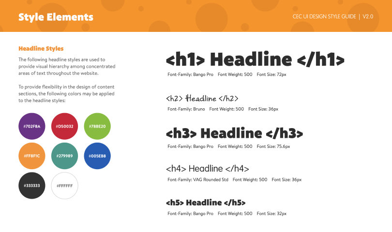
I expanded the brand toolkit by defining how colors, typography, and graphics work together online. I also created a Figma component library that documented UI elements for consistent use across pages.

I expanded the brand’s palette to better support digital use cases. New color rules defined how primary, secondary, and accent tones should be applied across UI elements—ensuring flexibility for different content types while maintaining a cohesive look and feel.


Finally, I defined the most frequently used components—detailing their structure, behavior, and relationships to other elements. To illustrate interactivity, I showcased key examples like Toggles and Pagination, documenting their states, transitions, and behaviors for developers. The full library of interactive components can be explored in the Design Guide.

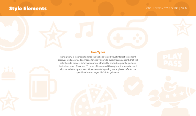
Icons were standardized to improve clarity and consistency across the site. After auditing existing content, I identified seven distinct icon types, each with a specific purpose. I documented their usage, behaviors, and visual rules to help users scan content more easily and take action with confidence.

