
let's talk.
Get in touch with me
connect.
Find me on LinkedIn
9Tea3 is a Chicago-based tea brand blending premium organic teas with the energy of 90s hip-hop. I partnered with the founders to define the brand identity and creative direction—designing the logo, product packaging, Shopify site, and social templates to launch their vision of a new “leafstyle.”
The founders wanted a brand that fused wellness and culture—something bold enough to stand out in a crowded tea market while staying authentic to its hip-hop roots. My role was to translate that energy into a visual identity that felt fresh, nostalgic, and instantly recognizable.
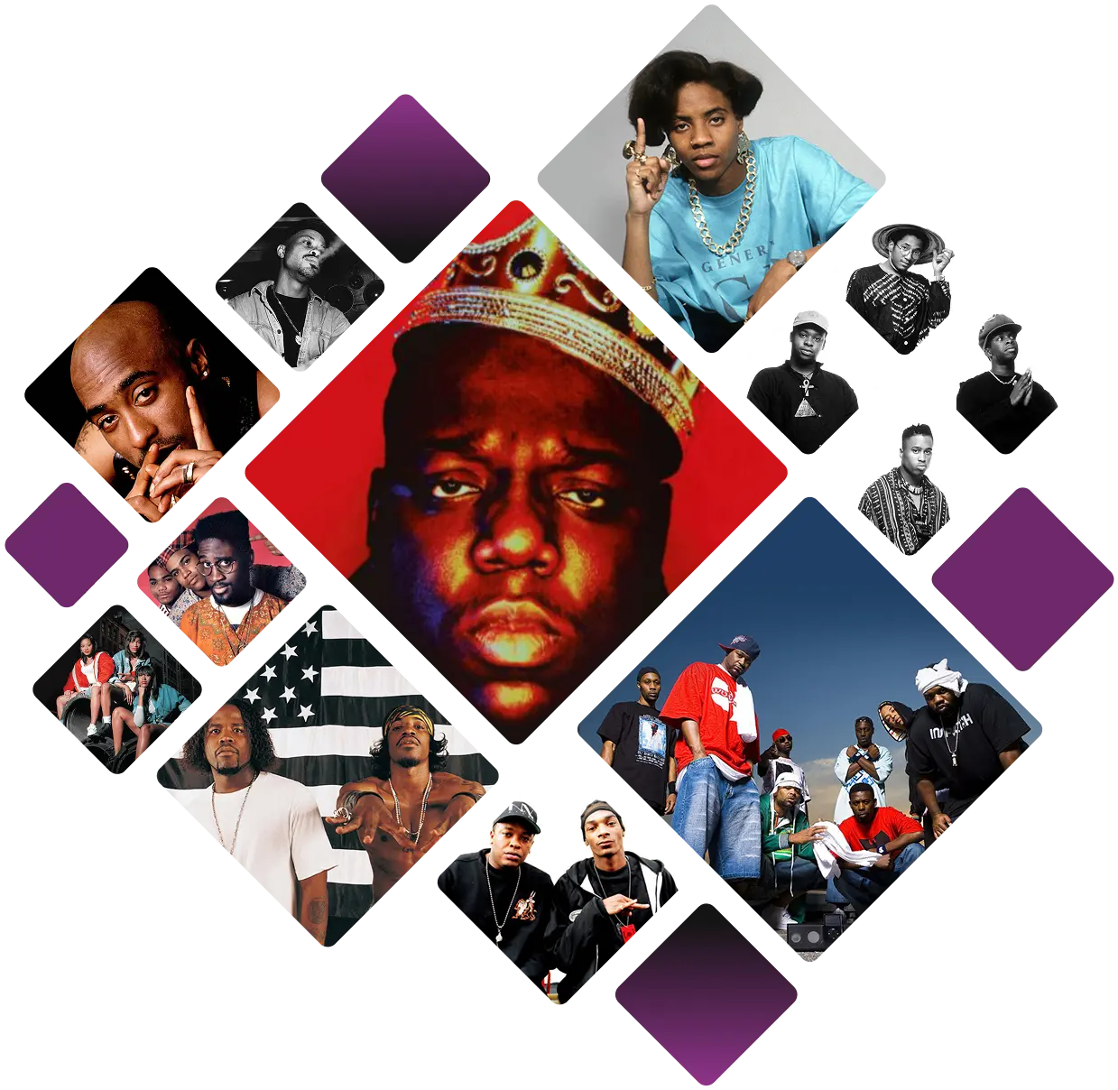
9Tea3 is a brand rooted in the culture and music of the 90s—an era defined by artists like The Notorious B.I.G., Tupac, Wu-Tang Clan, and A Tribe Called Quest. Blending wellness, culture, and flavor with hip-hop, R&B, and soul, 9Tea3 embodies innovation and transformation. To reflect this spirit, I infused graphic nostalgia and bold hip-hop references to create a distinctive, authentic brand identity.
I began the logo design process by exploring typefaces in two directions: graffiti-inspired fonts tied to hip-hop culture, and styles with distinctive “9” and “3” numerals that could work as a logomark. The graffiti lettering—handwritten, stenciled, and intentionally imperfect—captured the raw energy of the culture, while numeral-focused fonts offered a bold graphic presence.
Once I narrowed down the typefaces, I moved into digital sketching on my iPad. I explored different ways to bring the brand’s essence to life—some with leaf motifs, others with tea sachets, and some purely typographic. After sketching a wide range of ideas, I refined and selected the strongest concepts to carry forward into vector form in Illustrator.

Inspired by Q-Tip, this concept pairs symmetry with unconventional detail. I customized the Staatliches typeface—adding sharp angles, tight kerning, and negative space—to create a bold logo. A tea leaf replaces the bar in the “A” to tie in the product.
Echoing the spirit of A Tribe Called Quest, this concept blends clean geometry with hip-hop energy. The design balances symmetry and playfulness, reinforcing the brand’s cultural roots.
Named after Yasiin Bey’s 1999 track, this design uses Megrim and Museo Moderno Light typefaces to build a geometric logo. Influenced by Egyptian symbolism and X Clan’s 90s aesthetic, it evokes precision and heritage.
This logo channels graffiti’s raw origins—once seen as vandalism, now celebrated as art. Using Sedgwick Avenue and Sivar Pro, it captures the expressive, rebellious spirit that mirrors hip-hop’s rise to the mainstream.
Borrowing from the emcee tradition, this concept uses a circle to represent both a rap cypher and the ring left by a tea cup. A pencil brushstroke paired with the Arsilon typeface gives the design a hand-crafted, cultural feel.
Named after the 1996 hit, this concept plays on both dipping tea and hip-hop culture. A tea sachet graphic formed from the numbers 9 and 3 creates a distinctive logomark that bridges product and cultural moment.
In creating the product packaging, I began by creating the labels. Using the leaf from the logo the focal point, assigning each product a color that reflected its key ingredient or theme. Printer restrictions required a white border, so I recommended black pouches to maximize contrast and vibrancy—resulting in a colorful yet cohesive product line.

After finalizing the product labels, I shifted to the Shopify website design using the Modular theme. I recreated its components in Figma to design each page, then exported graphics, images, and icons for upload. While the theme posed restrictions, I used custom HTML and CSS to replicate the Figma prototype and bring the design to life.


I designed branded visuals in Photoshop and Figma for 9Tea3's social media (Facebook, Instagram) to drive sales. I then exported these assets to Canva, creating custom templates featuring the 9Tea3 logo and product pouches to reinforce brand recognition, allowing the team to generate their own content.


Being that music is such an integral part of the 9Tea3 brand identity, the team wanted to include a page on the site called ‘Sips & Sounds’, wherein curated playlists are pulled in from Spotify. In addition to building the Sips & Sounds page, I also created the look and feel of the brand’s Spotify channel.


